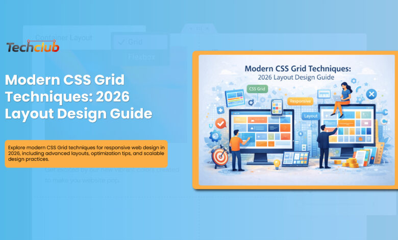
Designing with CSS Grid: Modern Layout Techniques
The web development landscape of 2026 demands layouts that are both sophisticated and adaptable. CSS Grid has emerged as the cornerstone of modern web design, offering developers unprecedented control over their layouts. Let’s explore how to leverage its full potential in today’s digital ecosystem.
The New Era of Layout Design
Gone are the days of wrestling with floats and complex positioning. CSS Grid has matured into a robust system that handles everything from simple blog layouts to complex dashboard interfaces. What makes it particularly powerful is its ability to create responsive designs without excessive media queries.
Smart Grid Fundamentals
Let’s start with a pattern that’s becoming increasingly popular:
.smart-container {
display: grid;
grid-template-columns: repeat(auto-fit, minmax(300px, 1fr));
gap: clamp(1rem, 3vw, 2rem);
padding: max(2vw, 20px);
}
This seemingly simple code creates a responsive layout that automatically adjusts based on viewport size while maintaining consistent spacing – a perfect example of modern grid implementation.
Advanced Techniques for 2026
1. Dynamic Content Areas
The latest approach to handling content areas involves using named grid lines for better maintainability:
.layout {
grid-template-columns: [sidebar-start] minmax(200px, 1fr) [content-start] minmax(500px, 3fr) [content-end];
}
2. Subgrid Revolution
Subgrid support has finally reached widespread adoption, allowing for more sophisticated nested layouts:
.card-grid {
display: grid;
grid-template-columns: repeat(3, 1fr);
grid-template-rows: subgrid;
}
3. Adaptive Spacing
Modern grid layouts now implement smart spacing that adjusts to both screen size and content density:
.adaptive-grid {
gap: clamp(1rem, calc(0.5rem + 3vw), 3rem);
padding: clamp(1rem, calc(1rem + 2vw), 4rem);
}
Performance Optimization
The key to high-performing grid layouts lies in strategic implementation:
- Use will-change sparingly for animated grid elements
- Implement content-aware breakpoints instead of device-specific ones
- Leverage modern CSS properties like aspect-ratio for consistent sizing
Accessibility Considerations
Modern grid implementations must prioritize accessibility:
.accessible-grid {
grid-template-columns: repeat(auto-fit, minmax(min(100%, 300px), 1fr));
/* Ensures readable line lengths */
max-width: 65ch;
}
Future-Proofing Your Layouts
As we look toward the future, several practices have emerged as essential:
- Container Queries: Implement layout changes based on component size rather than viewport
- Logical Properties: Use directional-agnostic properties for better internationalization
- Variable Support: Leverage CSS custom properties for dynamic grid modifications
Practical Implementation Tips
- Start with a mobile-first approach using minimal grid definitions
- Use feature queries (@supports) for progressive enhancement
- Implement fallback layouts for legacy browsers
- Test across different viewport sizes and device orientations
Conclusion
CSS Grid has transformed from a promising technology to an indispensable tool in modern web development. By embracing these advanced techniques while maintaining focus on performance and accessibility, developers can create layouts that are both visually impressive and functionally robust.The future of web layout lies in creating systems that are flexible enough to adapt to any content while maintaining performance and accessibility standards. As we continue through 2026, mastering these techniques will be crucial for any serious web developer.